Use Maps to Better Understand Business Processes
Business Processes are the core of what a company does on a regular basis. It is critical they are documented, reviewed, and updated on a regular basis. A documented process often highlights: Why it exists, Starting Points, Inputs, Outputs, End Points, Visual Map, and Roles. They become pivotal for training, audits, quality improvement, and intercompany conversations. Let’s dive further into creating maps to better understand business processes.
How do I start using maps to better understand business processes?
The most challenging piece for most… How do I get started when I do not fully understand our business process? Well, it is easy! Is there already documentation in place? If so, begin to review that information and identify how old, who created it, and who owns the process. From here, begin by reviewing this documentation with your Subject Matter Experts (SMEs). Look see what the inputs and outputs of the process are. What if there is no documentation? Determine who the SMEs are and ask to record a video of running with the process live. Or walk-through steps and record them. This serves as the perfect place to begin your Process Map.
What tools can I use to create a Process Map?
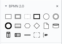
Check out Lucid Chart or Draw.io. Both are terrific design tools and have free versions. While using, try to select shapes specific to Business Process Model and Notation (BPMN or BPMN 2.0). These are standard and widely known shapes in many industries.

Sometimes it is best to meet with SMEs directly and draw a map out together on a marker board, especially if you are drafting what a future process will look like! You can always take a photo of the artwork and bring it back to ‘Lucid Chart’ or ‘Draw.io.’
Okay, now that we have the basics down, let us move to the topic at hand.
How do I use Maps to make Business Processes easy to Understand?
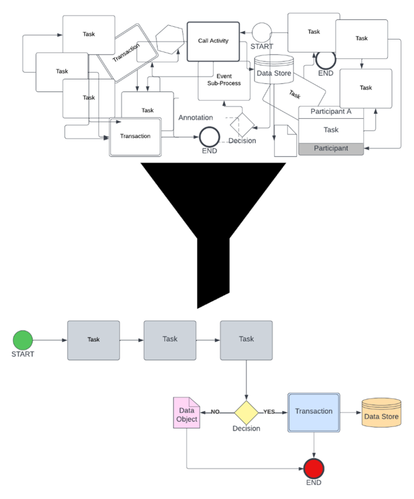
- Use the 80% Rule. For this process, what are we doing 80% of the time? Do not let that single instance override what we do on a regular basis.
- Keep it short when describing the task. Rule of thumb is 3-5 words per node (shapes).
- Do not be afraid to use a Legend. This is a handy way to use acronyms on the shapes themselves and shorten text.
- Organization is CRITICAL. The moment the map is confusing and difficult to read, it becomes useless. Use the guidelines within ‘Lucid Chart’ or ‘Draw.io’ to keep nodes symmetrical. Limit the use of too many angles when connecting nodes, they should only have (1) right or left angle. Keep lines separated from one another, this way routes are easily followed. Use colors to highlight Tasks, Decisions, Start, End, etc.
See example:

What if the Business Process involves numerous teams or departments?
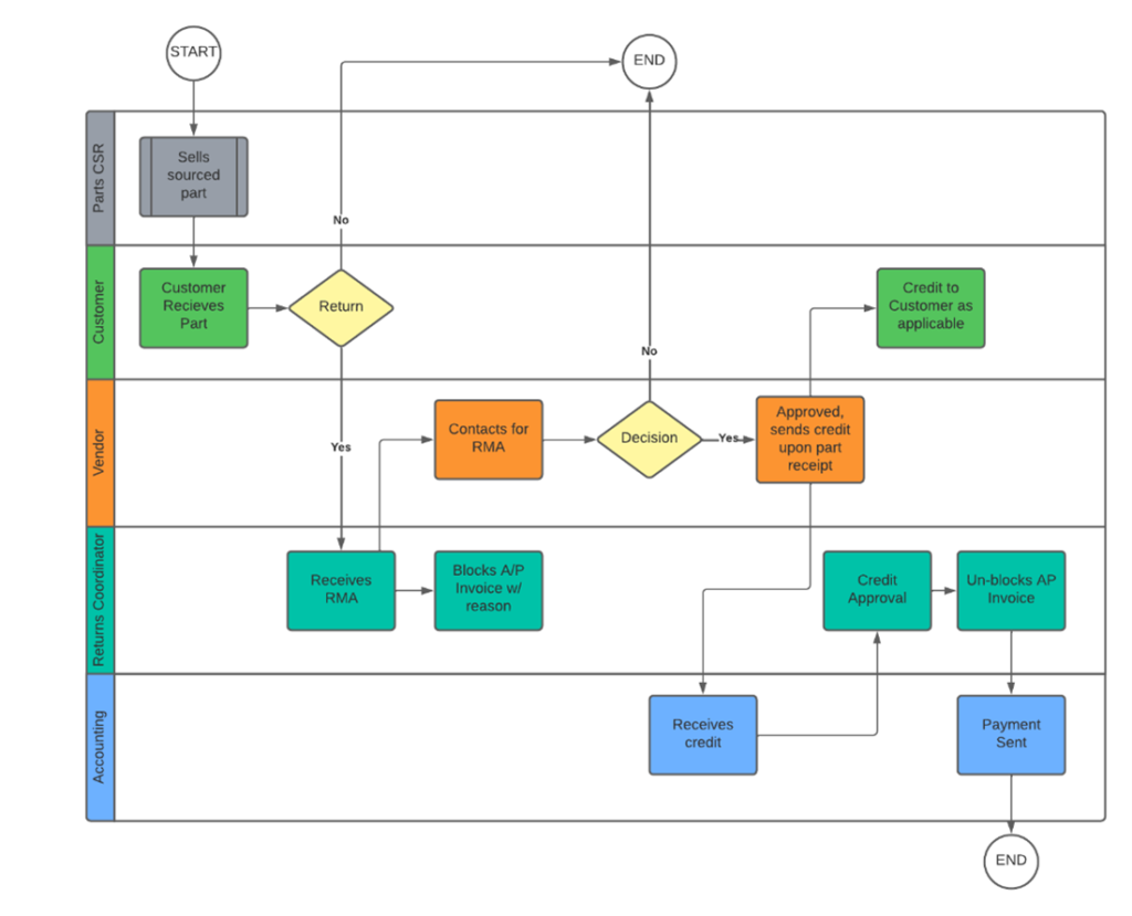
Answer: Swim Lane. These diagrams are critical to visualize how tasks and data reach other teams / departments. They are especially useful when showing process handoffs between teams.
Tip: Use the same colors for each lane. It makes it easier to read and understand where you are.

What do all the shapes mean?
The most widely used shapes for a business process map are Task (square), Decision (Diamond), Circle (start or end), and Dotted Square (to call out a Sub-Process or Supporting Process).
Here is a link to a helpful guide as you learn how to process map! https://creately.com/blog/diagrams/business-process-modeling-tips/
The Takeaway
In this article, you have learned that Maps (which support documented company processes) are an excellent way to better understand what businesses do in detail. Knowing why it exists, how to create them, better support audits, quality improvement, and intercompany understanding. Sometimes the easiest approach is to start with drawing it out on a whiteboard!
If you’d like to learn more about using platforms like Salesforce, integrating existing systems with Salesforce, or custom platform development, we’re here to help. Drop us a line any time!